
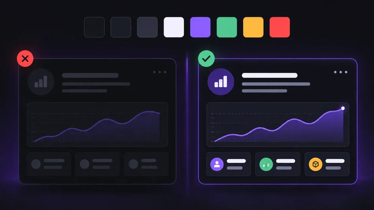
When I tested my admin panel seriously in dark mode for the first time, I was rather disillusioned. In the light design everything looked fine. But as soon as I switched to the dark design, headings like “Berufserfahrung” were barely visible: dark grey text on an almost black background. Table contents, hints and some icons were also hard to read.
In this post I describe why this happened, what I learned about contrast in dark mode and how I solved the problem with centrally defined colours.
The cause: colours that know nothing about dark mode
At first I thought I had forgotten a colour somewhere. After some research it was clear: this is one of the most common problems when you add a dark mode to an existing project afterwards. In my case it came from two places:
- My admin panel is based on an older template with Bootstrap 4. Many text colours are hard-coded in its CSS, for example for card headings, tables or form labels. These colours always apply – no matter which design is active.
- In addition, over time I had entered many colours directly in my views as hex values or inline styles. Every single one of them ignores the design.
What I learned about contrast
During my research I read several guides on accessible dark interfaces (sources below). Four points changed my view:
- A dark mode is not automatically accessible. The WCAG rules also apply to dark designs: at least 4.5:1 contrast for normal text and 3:1 for icons, input borders and other controls.
- No pure white on pure black. Maximum contrast quickly looks harsh on a dark background. A slightly dimmed white for text and a very dark grey instead of black work better.
- Brand colours need their own dark variant. My purple looks good on white but is too dark on a dark background. That's why I use a lighter variant for dark mode.
- Colours belong in one central place. Instead of spreading colours throughout the code, you define them once as variables with a meaning, so-called design tokens.
My solution: design tokens as CSS variables
Instead of recolouring every page individually, I define all colours once – separately for light and dark. Here is a simplified version:
:root[data-theme="dark"] {
  color-scheme: dark;
  --bg: #0B0B0F;
  --surface: #141419;
  --text: #E5E7EB;      /* Haupttext, gut lesbar */
  --text-2: #A1A1AA;    /* Nebentext */
  --accent: #A78BFA;    /* hellere Lila-Variante */
}

:root[data-theme="light"] {
  color-scheme: light;
  --bg: #F6F7FB;
  --surface: #FFFFFF;
  --text: #18181B;
  --text-2: #52525B;
  --accent: #6D28D9;
}
In the rest of the CSS I then only use the variables, for example color: var(--text). When the design changes, all colours change at once.
The color-scheme line was a small discovery for me: it makes browser elements such as scrollbars, checkboxes or date fields adapt automatically to the light or dark design.
A “bridge” to the old Bootstrap CSS
I didn't want to rewrite the old template. So at the very end I load my own CSS file that overrides Bootstrap's fixed colours with my variables:
:root[data-theme="dark"] .card-header h4,
:root[data-theme="dark"] .table td,
:root[data-theme="dark"] label {
  color: var(--text);
}
Because this file is loaded last, it wins against the rules from the template. This way every page reacts to dark mode without me touching the template. I'm gradually replacing the hard-coded colours in my views with reusable classes.
How I check contrast now
I used to choose colours by feel. Now I check them: in Chrome DevTools, the colour picker shows the contrast ratio of a text colour against its background and marks whether the WCAG values are met. It only takes a few seconds and prevents exactly the mistakes I made at the beginning.
Conclusion
Above all, I took away three things:
- Manage colours centrally instead of scattering them across the code.
- Measure contrast instead of deciding by feel.
- Test both designs – not just the one you work in yourself.
At the same time it was reassuring to see that I'm not alone with this problem. Many developers run into exactly this, and the solutions are well documented once you know what to search for.
Sources
- ColorContrast – Dark Mode Contrast: The Complete Guide to WCAG-Compliant Dark UI
- Material Design – Dark theme
- BOIA – Offering a Dark Mode Doesn’t Satisfy WCAG Color Contrast Requirements



Comments.
No comments yet.